Are These Website Design Mistakes Holding You Back?
Have you ever clicked on a website, only to be frustrated by slow loading times, confusing layouts, or hard-to-read text? You’re not alone. Many businesses struggle with website design issues that drive potential customers away instead of drawing them in. In today’s digital age, where your website often serves as the first impression for your business, a poorly designed site can significantly impact your credibility, customer trust, and bottom line. The good news is that most of these common mistakes are avoidable with little knowledge and planning.
In this blog, we’ll explore some of the most frequent website design errors and provide practical tips on how to avoid them. Whether you’re designing a new website from scratch or looking to improve an existing one, understanding these pitfalls can help you create a user-friendly, SEO-optimized site that attracts and retains visitors.
1. Ignoring Mobile Optimization
In a world where mobile devices account for more than half of global internet traffic, ignoring mobile optimization is a critical mistake. Websites that aren’t mobile-friendly not only frustrate users but also suffer in search engine rankings. Google’s mobile-first indexing means that if your website isn’t optimized for mobile, you’re likely missing out on significant organic traffic.
How to Avoid This:
- Responsive Design:Implement a responsive design that adjusts content and layout based on the device’s screen size.
- Mobile-First Approach: Consider designing for mobile devices first and then scaling up for larger screens. This ensures that the mobile experience isn’t just an afterthought.
- Test on Multiple Devices:Test your website frequently on a range of mobile devices to make sure it works and is user-friendly.
2. Overlooking SEO Best Practices

A beautifully designed website means nothing if it doesn’t rank well on search engines. Neglecting SEO is a common mistake that can lead to low visibility, reduced traffic, and missed opportunities. Keywords, meta descriptions, alt text, and internal linking are all crucial elements that should be integrated into your web design process.
How to Avoid This:
- SEO-Friendly URLs:Use clean, descriptive URLs that include relevant keywords.
- Optimize Images:Reduce the size of photos to speed up loading times and make sure the alt text is clear.
- Meta Descriptions: Write compelling meta descriptions for each page that encourage clicks from search engine results.
- Keyword Integration:Naturally integrate keywords into your content, headers, and meta tags without overstuffing.
3. Cluttered and Overcomplicated Layouts
Simplicity is key in web design. Overloading your website with too many elements, such as banners, buttons, and pop-ups, can overwhelm visitors and drive them away. A cluttered design makes it difficult for users to navigate your site and find the information they need, leading to a poor user experience.
How to Avoid This:
- Focus on White Space: Use white space to create a clean and organized layout that guides users’ eyes to important elements.
- Limit Distractions:Keep the number of pop-ups, ads, and banners to a minimum. Focus on what truly matters: the user’s ability to navigate your site with ease.
- Prioritize Content: Ensure that the most important content is prominently displayed and easily accessible.
4. Slow Loading Times
The speed of a website is important for SEO and user experience. Studies show that if a website takes more than three seconds to load, users are likely to abandon it. Slow websites not only frustrate users but also negatively affect search engine rankings.
How to Avoid This:
- Optimize Images and Videos:Compress large files without sacrificing quality to reduce load times.
- Leverage Browser Caching:Store static resources locally on the user’s device to decrease load times on subsequent visits.
- Minimize HTTP Requests:Reduce the number of elements on your page, such as scripts, images, and stylesheets, to speed up loading times.
5. Poor Navigation Structure
Navigation is the backbone of any website. If users can’t find what they’re looking for quickly, they’re likely to leave. A poor navigation structure leads to confusion and frustration, resulting in higher bounce rates.
How to Avoid This:
- Clear and Intuitive Menus:Organize your menu items logically, with clear labels that guide users to the information they need.
- Breadcrumbs: Implement breadcrumb navigation to help users understand their location on the site and easily backtrack if needed.
- Search Functionality:Include a search bar on your site to help users find specific content quickly.
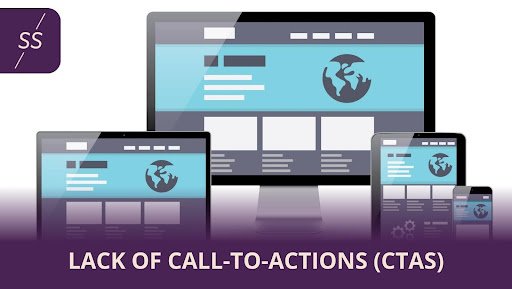
6. Lack of Call-to-Actions (CTAs)

A website without clear call-to-actions (CTAs) is like a map without directions. CTAs guide users toward the desired actions, whether it’s making a purchase, signing up for a newsletter, or contacting your business. Without them, users may leave your site without taking any action.
How to Avoid This:
- Prominent CTAs: Place CTAs in visible areas, such as above the fold or at the end of blog posts, where users are more likely to see them.
- Clear and Concise Language:Use straightforward, action-oriented wording, like “Buy Now,” “Sign Up,” or “Contact Us,” to instruct users on what to do.
- A/B Testing: Test different CTA designs, placements, and wording to see what works best for your audience.
7. Inconsistent Branding
Your website is an extension of your brand. Visitors may become confused and lose interest in your brand if your branding is inconsistent. Every element on your site, from colors and fonts to imagery and tone, should align with your overall brand message.
How to Avoid This:
- Brand Guidelines:Develop and adhere to a set of brand guidelines that cover all visual and textual elements of your website.
- Consistent Imagery: Use images that reflect your brand’s style and message, and avoid mixing different styles.
- Uniform Fonts and Colors: Stick to a consistent color scheme and font selection throughout your site to maintain a cohesive look.
8. Neglecting Accessibility
In addition to being required by law in many places, accessibility is an essential component of web design. A website that isn’t accessible to all users, including those with disabilities, risks alienating a significant portion of your audience and could lead to legal consequences.
How to Avoid This:
- Alt Text for Images: Help users who use screen readers by providing alt text for photos that describe the image.
- Keyboard Navigation:Because some people might not be able to use a mouse, ensure your website can be accessed using a keyboard.
- Contrast and Readability: Use high contrast between text and background colors to make content more readable for users with visual impairments.
9. Not Updating Content Regularly
Outdated content can make your website appear neglected and irrelevant. Regularly updating your content not only improves user engagement but also boosts your SEO efforts. Websites that periodically post original, pertinent material are given preference by search engines.
How to Avoid This:
- Content Calendar:Create and follow a content calendar to ensure that you’re regularly updating your site with new blogs, news, or product updates.
- Regular Audits:Conduct regular audits of your site’s content to identify and update outdated information.
- User-Generated Content:Encourage user-generated content, such as reviews and testimonials, to keep your site fresh and engaging.
10. Failure to Analyze and Adapt
Finally, one of the biggest mistakes in web design is the failure to analyze user behavior and adapt accordingly. Without data-driven insights, you’re essentially designing in the dark, making it difficult to identify what’s working and what needs improvement.
How to Avoid This:
- Analytics Tools:Use tools like Google Analytics to track user behavior on your site, such as page views, bounce rates, and conversion rates.
- User Feedback: Regularly gather feedback from users to understand their pain points and preferences.
- Continuous Improvement:Treat your website as a living project that requires ongoing analysis and improvement to stay relevant and effective.
Conclusion
A well-designed website is a powerful tool that can attract and convert visitors into loyal customers. These typical faults in website design can be avoided, and by using the advice given, you may create a website that looks amazing and functions incredibly well. Remember, your website is often the first interaction potential customers have with your brand—make sure it’s a positive one.
Prioritizing mobile optimization, adhering to SEO best practices, and ensuring a smooth user experience are just a few of the ways you can enhance your website’s effectiveness. Stay vigilant, keep learning, and continuously improve your website to keep up with the ever-changing digital landscape.
In the end, a successful website balances aesthetics with functionality, ensuring that visitors leave with a positive impression of your brand. Avoid these pitfalls, and you’ll be well on your way to achieving a website that truly stands out in the crowded online space.
About Us
Are you looking for the right partner to help you set up your website and manage your marketing efforts? Look no further than Sixberry Solutions—a cutting-edge digital marketing agency in Maine.
We started as a small business and understand that every business is unique and needs a personalized approach to its marketing efforts. We ensure your marketing strategies are tailored to your business and industry to help you grow.
Our services include SEO, website design, PPC advertising, On-touch reviews, and more. You can reach us at +1 (207) 830-1077 or fill out our contact form to know more. Don’t wait any longer–schedule a call today to get started!
Looking for a Portland web design company?
Contact Sixberry Solutions; we are a Maine web design company
Looking for a Maine SEO Service?
Contact Sixberry Solutions; we are a Maine SEO company.
